
Jägermeister Marketing Director: How Pink Sewer Trucks Are Just Like The Nike Swoosh
12 Apr, 2024
In this week's column Christian Stindt, Marketing Director for Jägermeister, urges all brands to consider whether their brand is distinctive enough to cut through the attentional filter.
My farming ancestors would probably shake their heads in disdain, but I for one do appreciate the advantages of living in an urban environment. Restaurants within walking distance! Public transportation! And the very definition of on-grid: electricity, hot water and a sewer system! So unless there’s a major change in our dwelling situation on the horizon, I don’t think I’ll be in need of professional sewer cleaning service anytime soon. But if I was, I would definitely give Caroline’s Effluent Services a call.
Caroline Who? That’s exactly what I thought. I’m not in the market for their services, I’m not their target audience and five minutes ago, I didn’t even know their name. And yet, they’re the first one who come to mind. Why? Because they’ve nailed two of the absolute basics of marketing:
1. Be distinctive
2. Be consistent
The first secret is the colour of their trucks. They’re all pink.
Not what you expect in a world of yellow, red, orange, maybe white world of heavy-duty vehicles. I’m not sure if this was the work of some genius brand consultant or a spur of the moment decision, but it works.
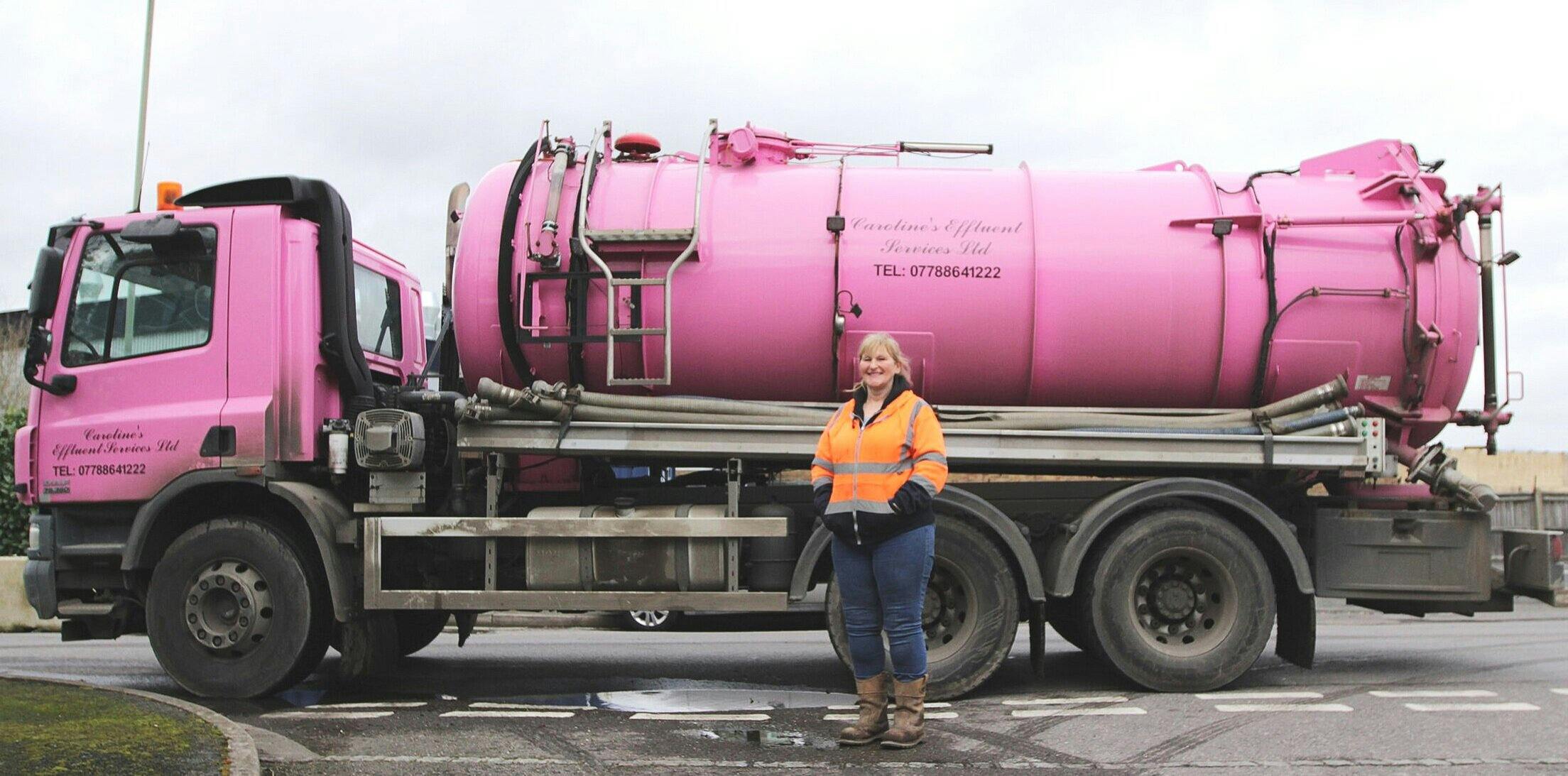
Caroline's Effluence Services - Certainly a stand out vehicle.
It works because it stands out and therefore makes it through what Daniel Levitin calls the attentional filter. This filter shields us from information overload and helps us ignore all the “regular” or “expected” bits of information. Levitin gives the example of driving your car down the motorway: You’re subjected to a million different noises, visual impressions from the road, the trees on the side, the cars etc - all of which your brain quietly acknowledges in the background and doesn’t bring to your attention unless there’s an unexpected change. For example, you’ll happily ignore the sounds from your tyres until the road surface changes. The moment the nicely soothing “hummmmmmmmmmmmmmm” changes to “flopflopflopflopflop” your attention system fires up within milliseconds, and only when you realise that the change in sound is due to a badly surfaced road rather than a blown tyre does it go back into standby mode.
Change triggers attention, and that’s exactly what Caroline’s pink trucks do. Pink is unexpected in the truck context and that change means they make it past your attentional filter. A simple, but highly effective trick.
The second secret is that it’s not just a one off. Pink trucks are their hallmark and accordingly well visible on their website, their social media pages, and even their SEO: google “pink sewer truck” and you’ll land right on their digital doorstep. Those rosé-coloured vehicles are probably their most valuable brand asset and Caroline’s Effluent Services are doing a cracking job of leveraging them.

We all know what the above is*, so there's no need to tell you. (*Marketing and brand gold dust is an acceptable answer)
There are too many examples out there of brands that change their brand asset suite way too often, when the much smarter - and usually also cheaper - approach is to identify what’s working and stick with it. In other words, identify what your strongest brand assets are and use them again and again.
As David Taylor points out, such a brand asset strength test should be in the arsenal of anyone in charge of brands. Think of the Nike swoosh. The Apple apple. The Intel jingle. Adidas’s three stripes. The Mercedes star. Louis Vuitton’s LV symbol. BA’s ribbon. Ikea’s blue stores. All in use for decades - and the list could go on forever. Yes, looking at your brand every single day, especially for the creative mind, makes it very easy to succumb to the desire to change things, but unless there are very good reason for it, don’t do it. And if you do want to change for instance by modernising your logo, do it with what Taylor calls “fresh consistency”: subtle changes are okay, but don’t change the fundamentals - see BMW’s recent logo upgrade or also Tesco’s subtle changes over the past decades.
So for Caroline’s Effluent Services, if ever they wanted to change their appearances, they should definitely keep the pink. And if I ever were to decide to go off grid, I’d know who to call.
Christian will be writing a regular column for MAD//Insight throughout the year.